
Data Visualization Tools
Whether you are just getting started or have been making visualizations for years, there are several resources to make it easier to create, edit, and share your creations.
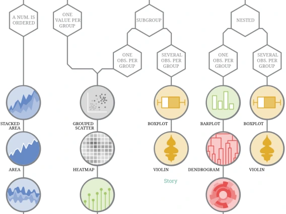
Maybe you need help deciding how to visualize your data. From Data to Viz provides a handy decision chart to guide your chart-making process. In addition to decision making, the resource also links out to examples of how to make the various visualizations.
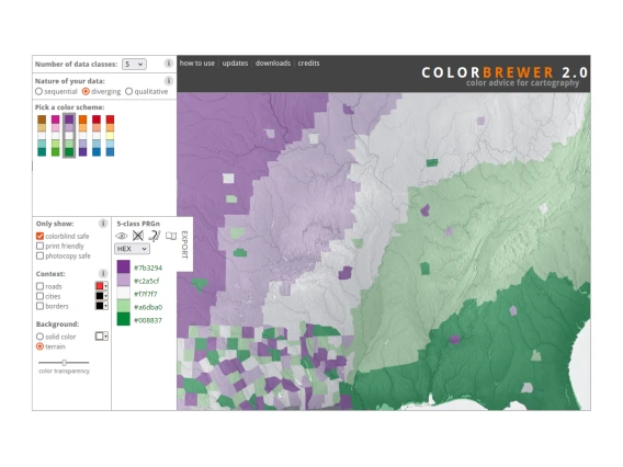
When communicating through images, it is always important to consider different media and different visual abilities. The ColorBrewer site is an interactive tool you can use to choose color palettes that fit your data types, while maintaining accessibility to a variety of audiences. If you want to test your own visualization, you can use the Color Blindness Simulator (Coblis) to see how your images appear to someone with a color vision handicap.
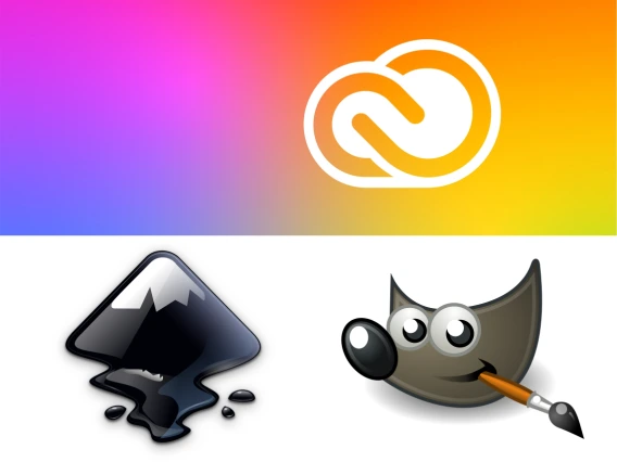
If you need to edit your graphics files, there are several programs to help you out. University of Arizona students, staff, and faculty have access to Adobe Creative Cloud, which includes the popular Illustrator and Photoshop software. If you are looking for open-source alternatives, you can use Inkscape (in place of Illustrator) and GIMP (in place of Photoshop).
To make your visualizations easy to reproduce for others and for yourself, the R and Python programming languages have much to offer. To learn more, you can use the Software Carpentry lessons on data visualization (R, Python), pick lessons from your discipline from the Data Carpentry lessons, or head to our Get Inspired page to find examples with the R & Python code necessary to make those visualizations.