
Get Inspired
When deciding how to display data, we are not working in a vacuum - we can draw on examples of visualizations (good and bad) to guide our process. Here are some resources that highlight different aspects of data visualization, including types of visualization and aesthetic decisions like color and shape.
Dataviz Inspiration is a curated gallery of recent visualizations from a variety of disciplines.
The R Graph Gallery includes multiple examples of visualizations made with the R programming language. Most examples also include the R code necessary to reproduce the visualization. If Python is more to your taste, take a look at the companion Python Graph Gallery.
Tidy Tuesday is a weekly community event for data visualization and data manipulation challenges. To see more examples, search your favorite social media platform for items with the #TidyTuesday tag.
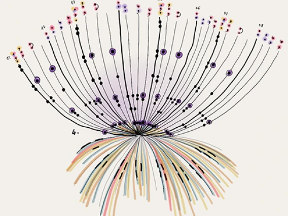
For some amazing artistic takes on data visualization, take a look at the work of Giorgia Lupi. In her talk, The Human Side of Data, she presents several ways of conveying meaning through images. The talk includes an exploration of the work of Ada Lovelace, Rachel Carson, and Mae Jemison through data visualization
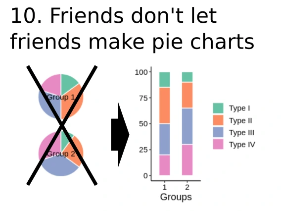
Sometimes it can be useful to see what not to do. The Friends Don't Let Friends site highlights common mistakes in data visualization and provides alternatives for effective communication. Most examples also include the code needed to make the visualization.